Creating a design system for a travel company
Overview
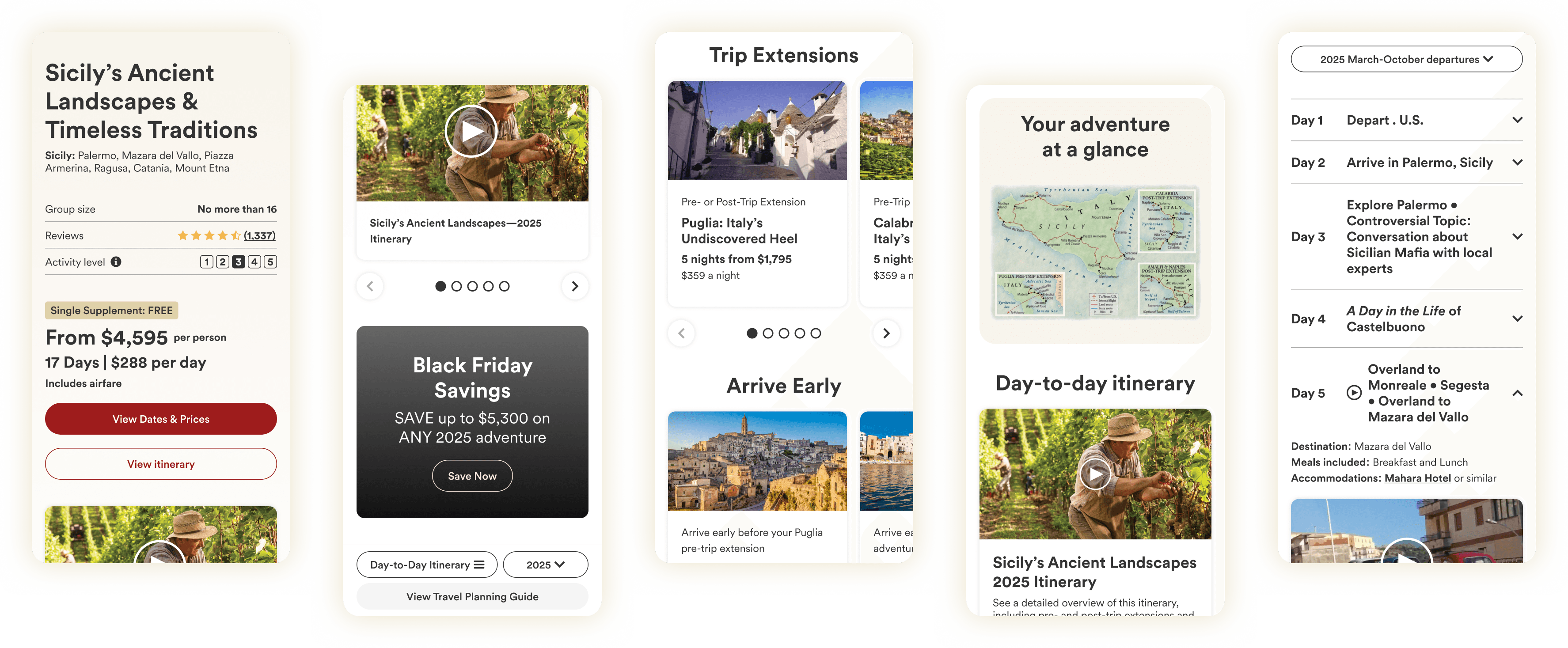
Overseas Adventure Travel (O.A.T.) made its name in print and is now shifting toward the web. A new CMS was on the way, but there was no shared design system to build pages on, so everything was being designed from scratch. I built that system and had it ready for the CMS launch, giving the team a consistent foundation to grow from.
Timeline
Q4 2024–Q2 2025
Role
UX/UI Designer

Problem → solution → outcome
The problem
O.A.T. didn't have a design system, so pages were being built without a shared set of rules. Buttons, type sizes, and typefaces varied from page to page, and the inconsistency showed. With a new CMS coming and the company leaning into web, we needed something that could scale and keep things consistent as the site grew.
Key constraints
Had to meet WCAG 2.1 AA accessibility standards
Tight timeline tied to the CMS launch
Several teams would be using the system
Components needed to scale across a lot of different content types
The approach
I built the system from the ground up, covering variables and tokens, typography, color, buttons, icons, and reusable components, all documented so people could actually use it. I worked closely with the front-end and back-end teams the whole way to make sure it looked right and was practical to build. Accessibility wasn't an afterthought, it was baked in from the start, and I structured everything with atomic design so it could grow without falling apart.
The outcome
The system made the site more consistent across both new and existing pages, and it cut down the time designers and engineers spent rebuilding the same things. Work moved faster, QA got more reliable, and we hit the CMS launch on schedule.
Design system deep dive
A closer look at the core pieces of the system and the thinking behind each one
Variables and tokens
Beneath the colors, type, and components sits a foundation of variables and tokens. Primitives hold the raw values, and semantic tokens sit on top, pointing back to them with a job attached. That extra layer is what lets the system scale. Because a token describes what something is for rather than what it literally is, a rebrand or color change becomes one edit that updates everywhere, and those same tokens map cleanly to code, which is part of what makes the Figma to live site handoff work.

Typography
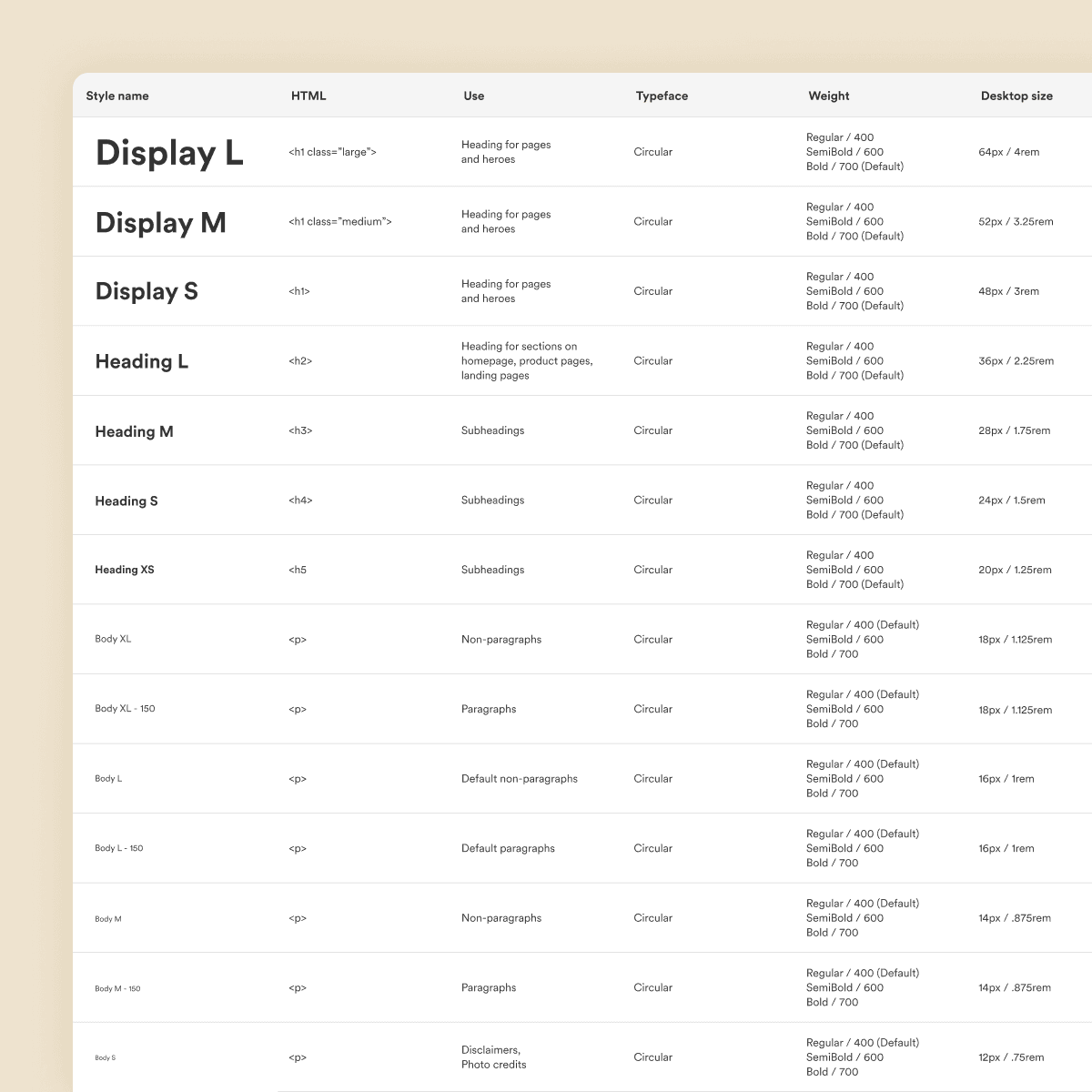
The old site ran on Open Sans, which is everywhere and didn't give O.A.T. much of an identity. I moved us to Circular, a warmer and more distinctive typeface that gives the brand its own feel on the web. From there I built a full type scale with set sizes, weights, and line heights, plus rules for how it responds across screen sizes, so hierarchy stays clear and consistent no matter the page.
Colors
I built a full palette with tints and shades for every core color, so there was always an accessible option ready instead of people eyeballing it. Each combination was checked against WCAG contrast standards, which kept text readable and put an end to the one-off color choices that were making pages feel disconnected.

Buttons and chips
I designed buttons and chips with every variation and state mapped out, enabled, hover, focus, active, and disabled, so their behavior stays predictable wherever they appear. Defining the states up front meant engineers weren't guessing at interactions, and people using the site got the same cues on every page.

Components
This is where the system pays off. I built reusable components out of the type, color, and button styles so designers and engineers could pull from one source instead of rebuilding the same things over and over. It cut duplication, sped up delivery, and kept the whole site feeling like one place.

A design system only matters if people actually use it, so I built this one to move cleanly from design into code instead of sitting in a Figma file. The components are structured so they can be pulled directly onto the site with Claude Code and Figma's MCP, which brings the real design over as a starting point instead of something that gets rebuilt by hand. A developer then goes in to clean it up and make sure everything holds together in production. The payoff is that the live site and the system stay in sync, handoff stops being a guessing game, and updating a component doesn't mean rebuilding the same thing in two places. The pages below were built this way.